Overview
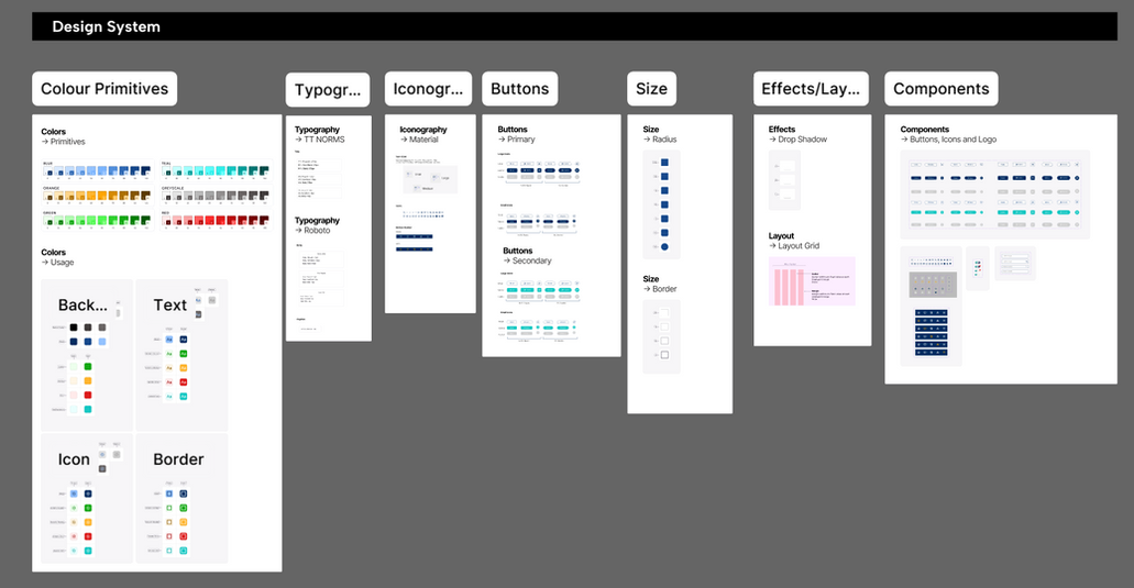
I created a scalable Figma design system to unify colors, typography, components, and interactions across [product/team]. The goal was to reduce design inconsistency and speed up delivery for both designers and developers.
Why a Design System?
To provide an organized set of components and principles that can be used across projects, instead of having to create these components from scratch each time. That not only saves time, but it ensures that the look and feel of a company's products or services is consistent.
Design System
Colors
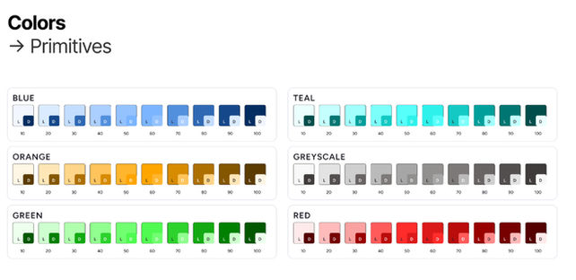
Created a structured color palette covering Neutrals, Brand Colors, and Feedback States (success, warning, error).

Each color is mapped to a semantic role, such as Background, Icons, Stroke, and Text, to support reuse and consistency across the product.


Set up color variables/tokens in Figma so designers and developers can apply consistent colors quickly and adjust themes without rebuilding components.
Typography
Mapped text styles to semantic roles (e.g., title, subtitle, body text) so designers can apply the right style quickly without manual formatting.

TT Norms for headings and titles to create a strong, modern visual hierarchy.
Defined three heading styles (H1, H2, H3), each with regular, semibold, and bold variants in three sizes to cover different layout needs
Roboto for body text to ensure high readability across longer content.
Created three body styles (large, regular, small) with regular, semibold, and bold variants, and set the smallest 12px size for captions and supporting text.

Iconography
Used Material outlined icons to align with a clean, modern visual style, and standardized them in three sizes (30×30, 23×23, 16×16) for use across different components and layouts.


Set up icons as Figma components with variants, making it easy to swap sizes, reuse them across the system, and keep icon usage consistent throughout the product.
Buttons
-
Designed a comprehensive mobile button system with Primary and Secondary styles (74 variants in total) to support a wide range of interaction needs.
-
Each button is available in regular and small sizes, across three states (Default, Selected, Disabled), and can be used with an Icon, Without an Icon, or as Icon-Only.


Created two shapes (Pill and Standard) to adapt to different layout and branding contexts, and built everything as Figma components so states and sizes stay consistent and easy to maintain.
Layout, Size & Effects
-
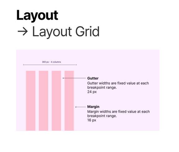
Defined a 4‑column grid for a 360 px mobile canvas with fixed 16 px margins and 24 px gutters to keep content aligned and breathable.
-
This grid system makes it easier to create consistent, readable layouts and maintain spacing rhythm across all screens


-
Defined a simple stroke scale with four tokens (XS, S, M, L) ranging from 0.5 px to 4 px.
-
This keeps borders light and consistent across components, from subtle outlines on inputs to stronger strokes for dividers and emphasis.
-
Created a radius scale with seven tokens (XXS, XS, S, M, L, XL, FULL) ranging from 2 px to fully rounded corners.
-
This makes it easy to apply consistent corner treatments across components, from subtle cards and inputs to fully pill-shaped buttons and chips.


Defined a small set of drop shadow styles to represent different elevation levels in the interface (e.g., cards, modals, and floating buttons). An effect in Figma, keeping light direction, blur, and opacity consistent so depth feels coherent across the entire system.


